Robotouille
Designing Interfaces and Interactions for a Robotic Cooking Game
September 2024 - May 2025
Role
Game UI/UX Designer
Team
1 project lead
7 developers
1 designer
Outcome
Playtesters reported it was easier to “see what needed to be done” and plan ahead.
OVERVIEW
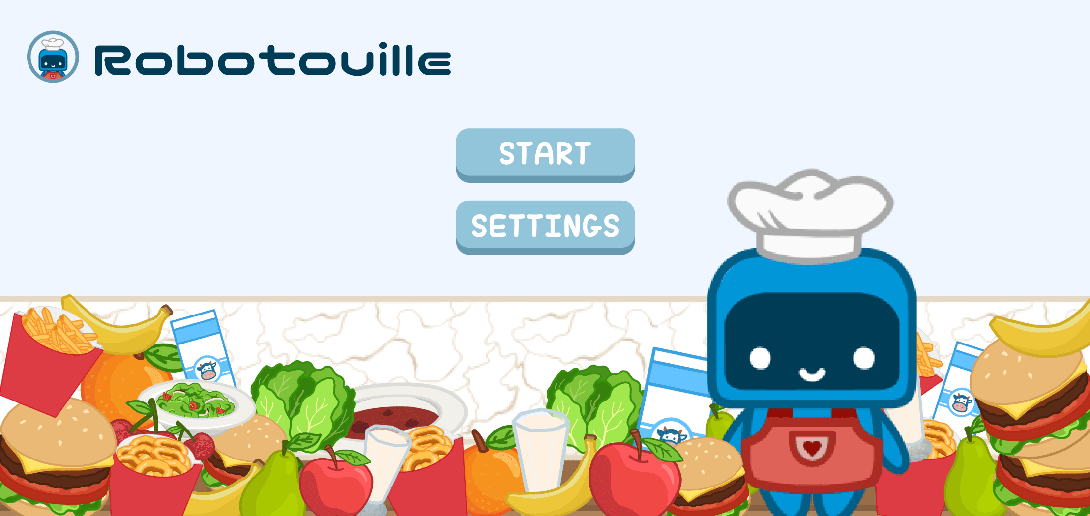
What is Robotouille?
Robotouille is a fast-paced cooking game where players pre-select sequences of actions for robot chefs to complete meal orders under time pressure.
The Challenge
The challenge was to create a UI that helps players track, prioritize, and execute orders in a high-pressure environment. Without a clear system in place, orders were easily missed, gameplay felt disjointed, and the experience lacked flow.
🔍 Problem: Players lacked a clear way to track and prioritize orders, leading to confusion and missed tasks in a fast-paced game that relies on planning and timing.
DESIGNING THE ORDER TICKET SYSTEM
Placing with Purpose: Avoiding Player Bias Through Layout
We originally discussed placing the order ticket panel on the side of the screen - a logical choice for single-player play. But during my conversation with the project lead, I raised a concern:
“If the game is multiplayer, wouldn’t placing the tickets on one side give one player an advantage?”
That question led us to shift the panel to the top of the screen, a more visually neutral placement that supports shared visibility and cooperative gameplay, ensuring both players have equal access to task-critical information.
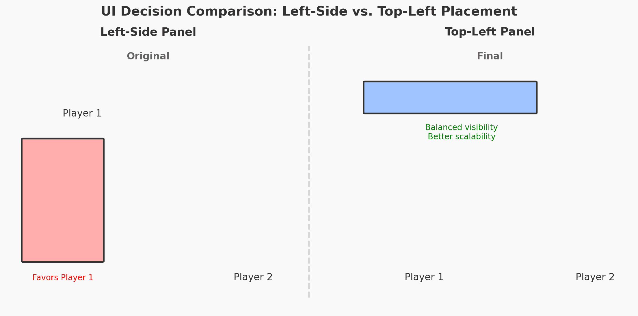
Pros and cons of order placement
✅ Outcome: Top-Left Panel
Navigating Information Density
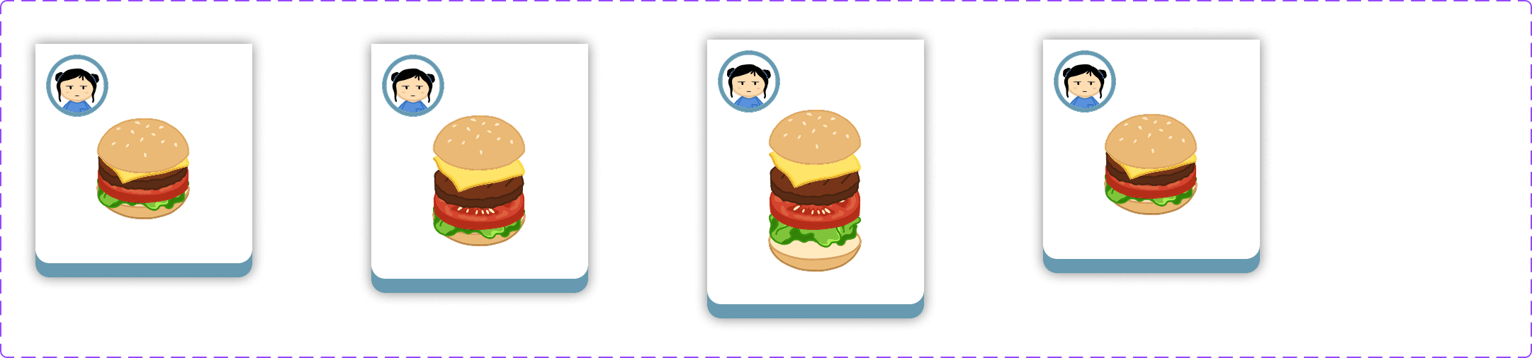
After finalizing the panel’s placement, my next concern was how the ticket would function in-game. It had to support fast, intuitive decision-making in a high-pressure environment.
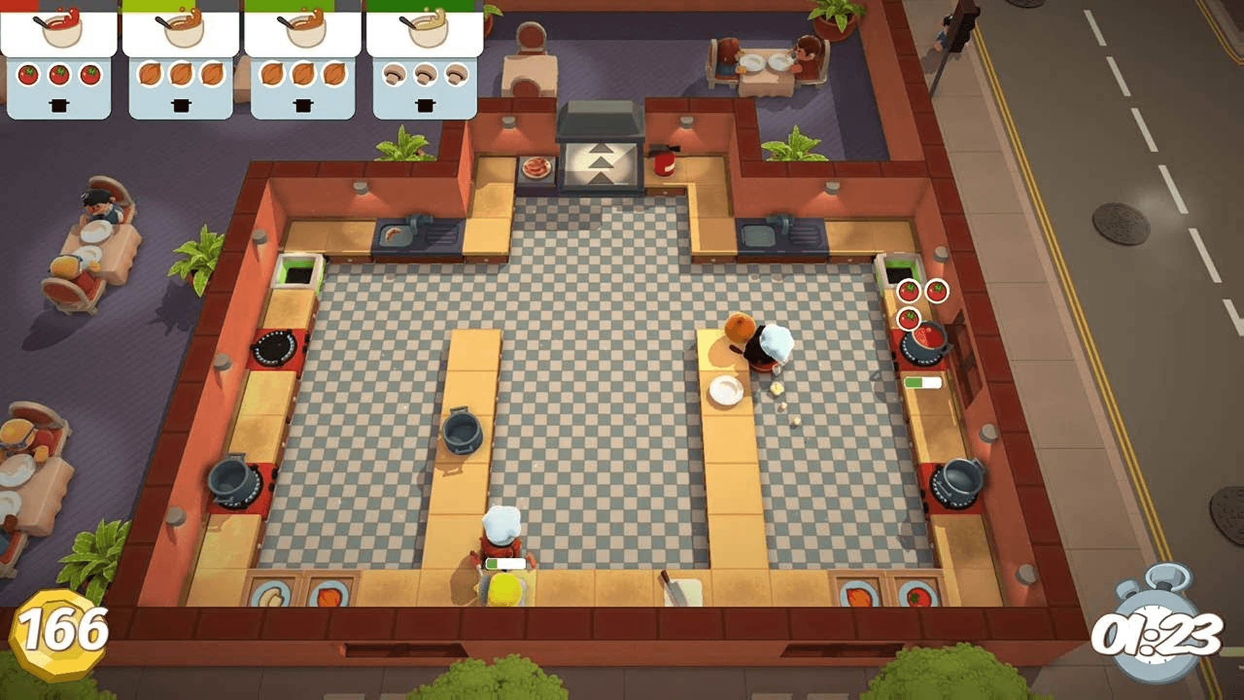
To explore how to make this work, I looked at game inspirations like Overcooked:
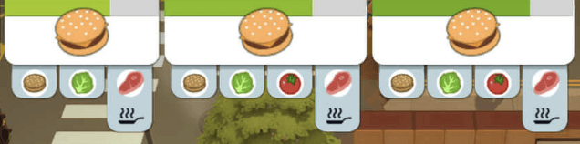
Overcooked's order ticket system
Vertical Stack
One of the more complex challenges I encountered was how to visually represent multi-ingredient orders, such as salads, which can contain several components.
My initial design used a hoverable vertical stack of ingredients:
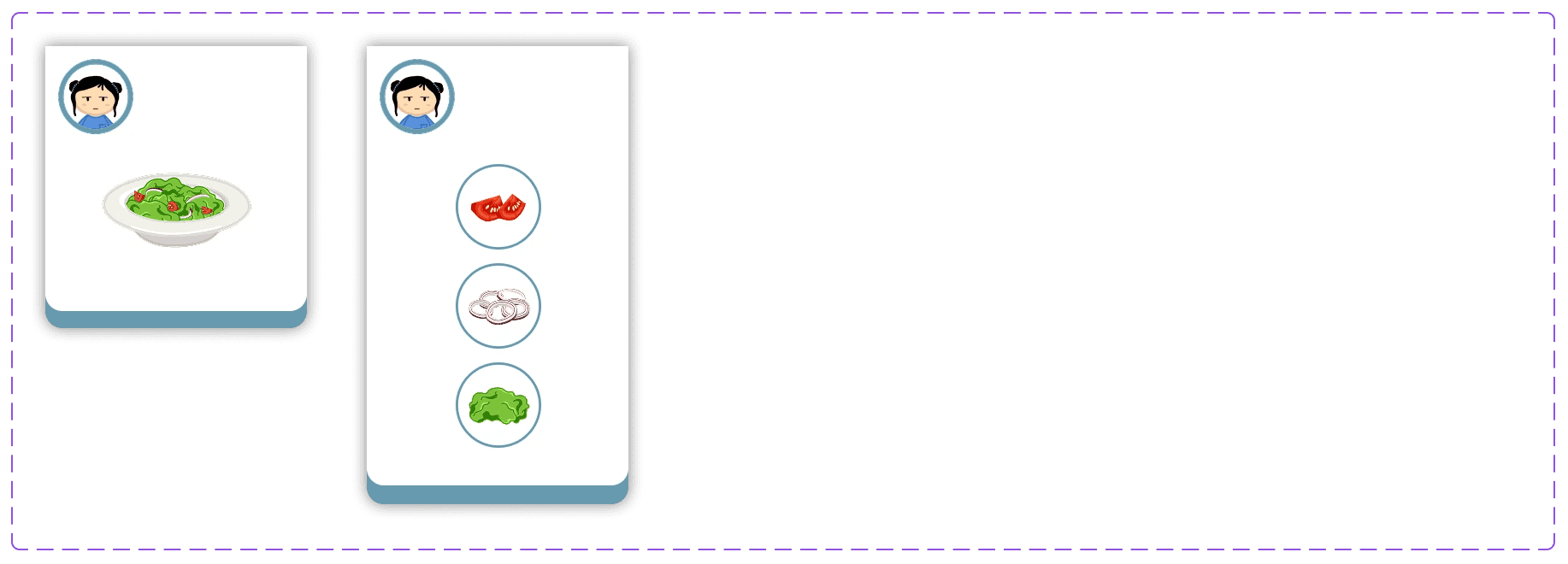
Overcooked's order ticket system
❌ Harder to scale: As the number of ingredients or types of orders grows, the UI becomes bulky and harder to manage across multiple orders.
❌ Requires interaction: Players need to hover to view full info, which adds a micro-delay, possibly frustrating under time pressure.
✅ Visually represents layers: Ingredients appear in the order they're stacked, mimicking real-world plating (great for burgers, sandwiches, etc.).
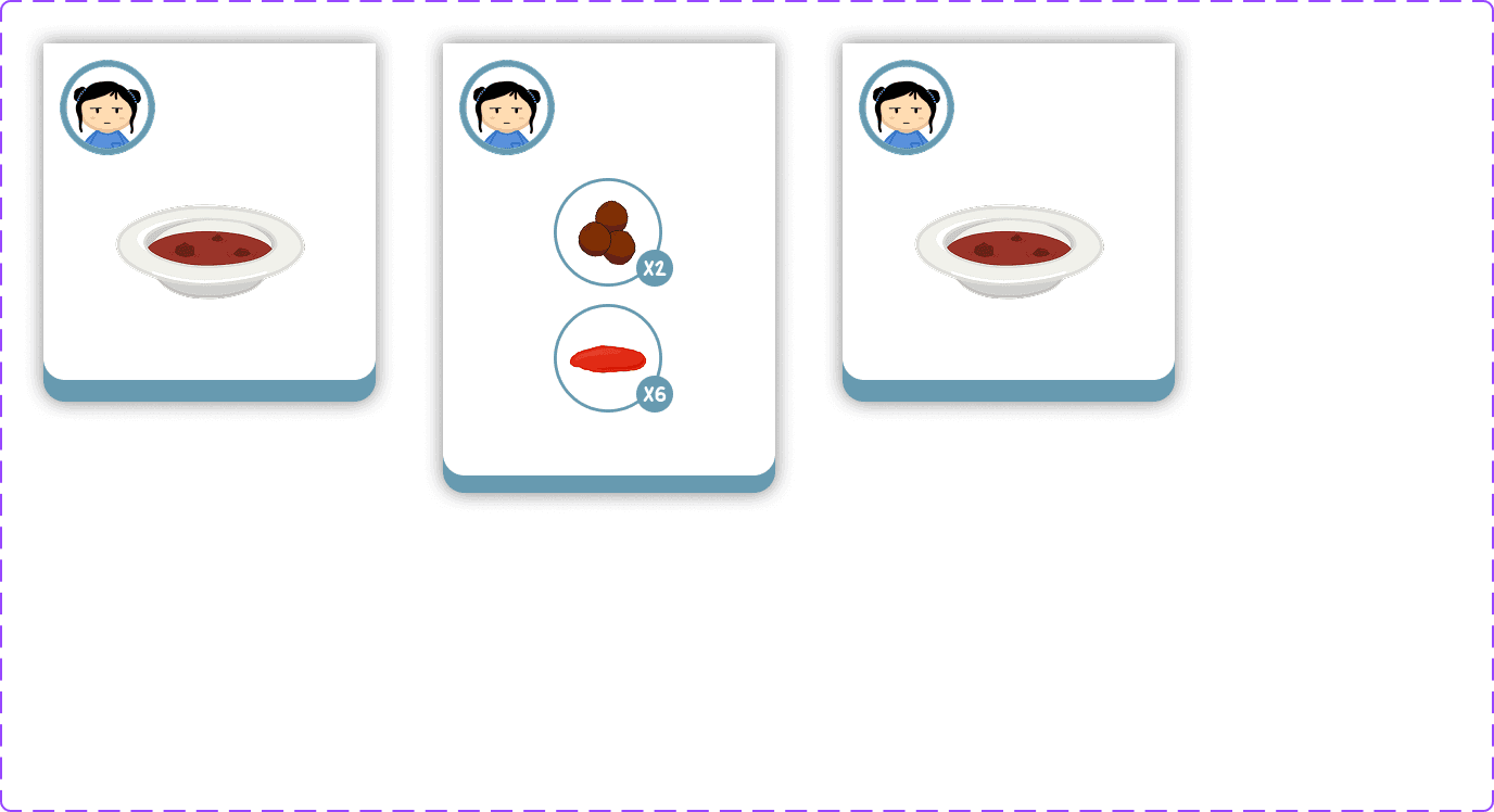
Hybrid Stack
As I explored how to visually represent multi-ingredient orders, I landed on a hoverable hybrid stack that utilizes both vertical and horizontal space.
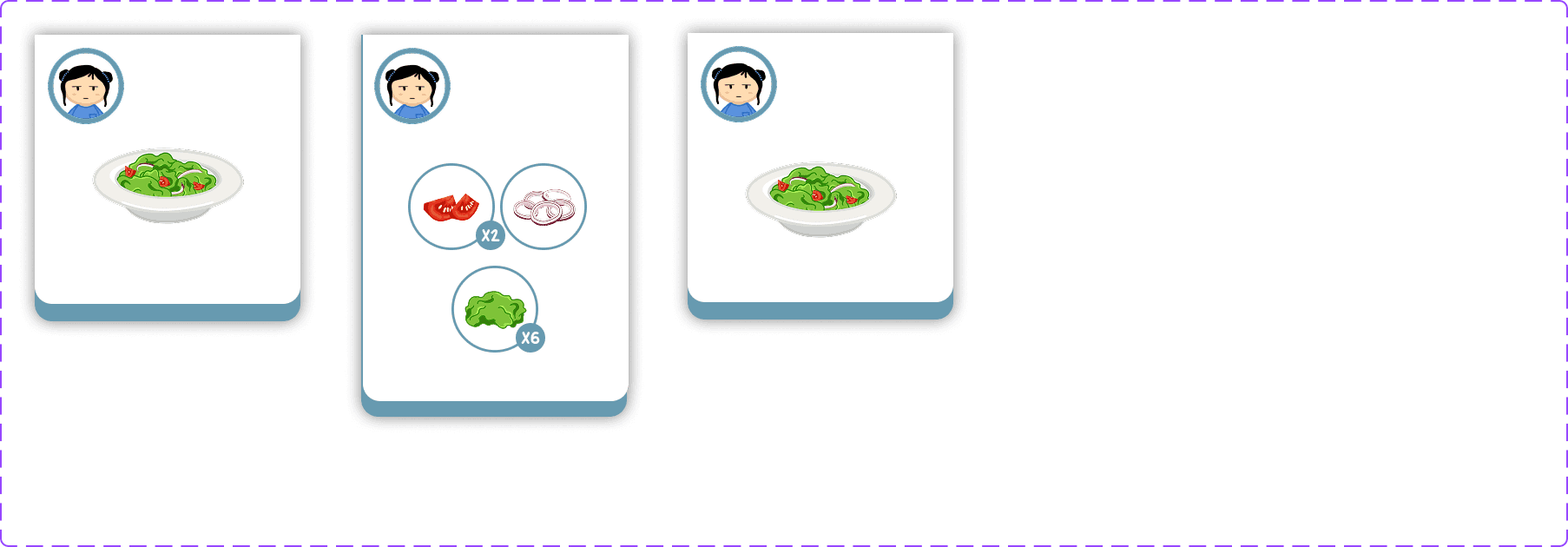
❌ Adds a step: Requires hovering, which can create a micro-delay under pressure.
✅ Maximizes screen efficiency: Uses both vertical and horizontal directions to fit more ingredients without cramming.
✅ Intuitive grouping: Ingredients can be grouped logically (e.g., toppings, base) across rows and columns.
Final Decision
The hybrid hover stack gave us the flexibility to display complex ingredient info while preserving gameplay clarity, a decision backed by both usability considerations and team consensus.
✅ Outcome: Hybrid Stack
Test out the prototype 👇
OTHER COOL STUFF I'VE WORKED ON… :)
Designing the World from Above
To design the landscape for Robotouille, I studied how other top-down games structure their environments, particularly games like Overcooked, Catastronauts, and The Sims. Each offered a different approach to spatial clarity, room boundaries, and player flow.
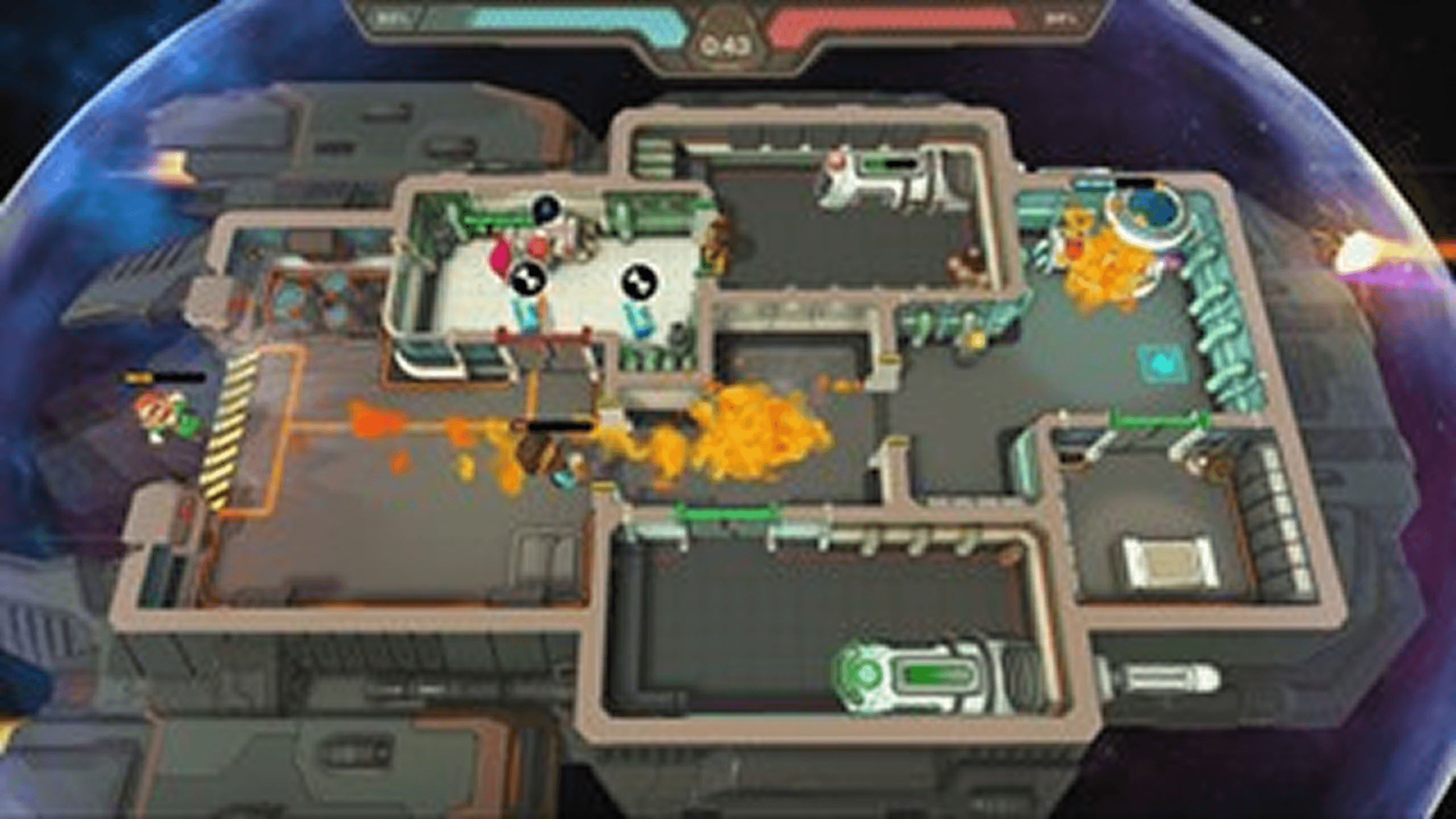
Catastronauts' view
Overcooked's view
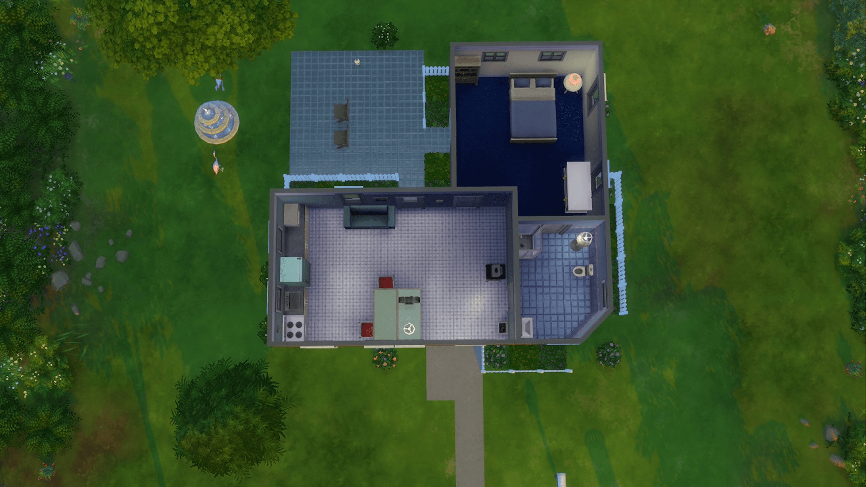
SIMS' view
✅ Outcome: Studying top-down games revealed that clear room boundaries and centered layouts improve spatial clarity and collaborative flow.
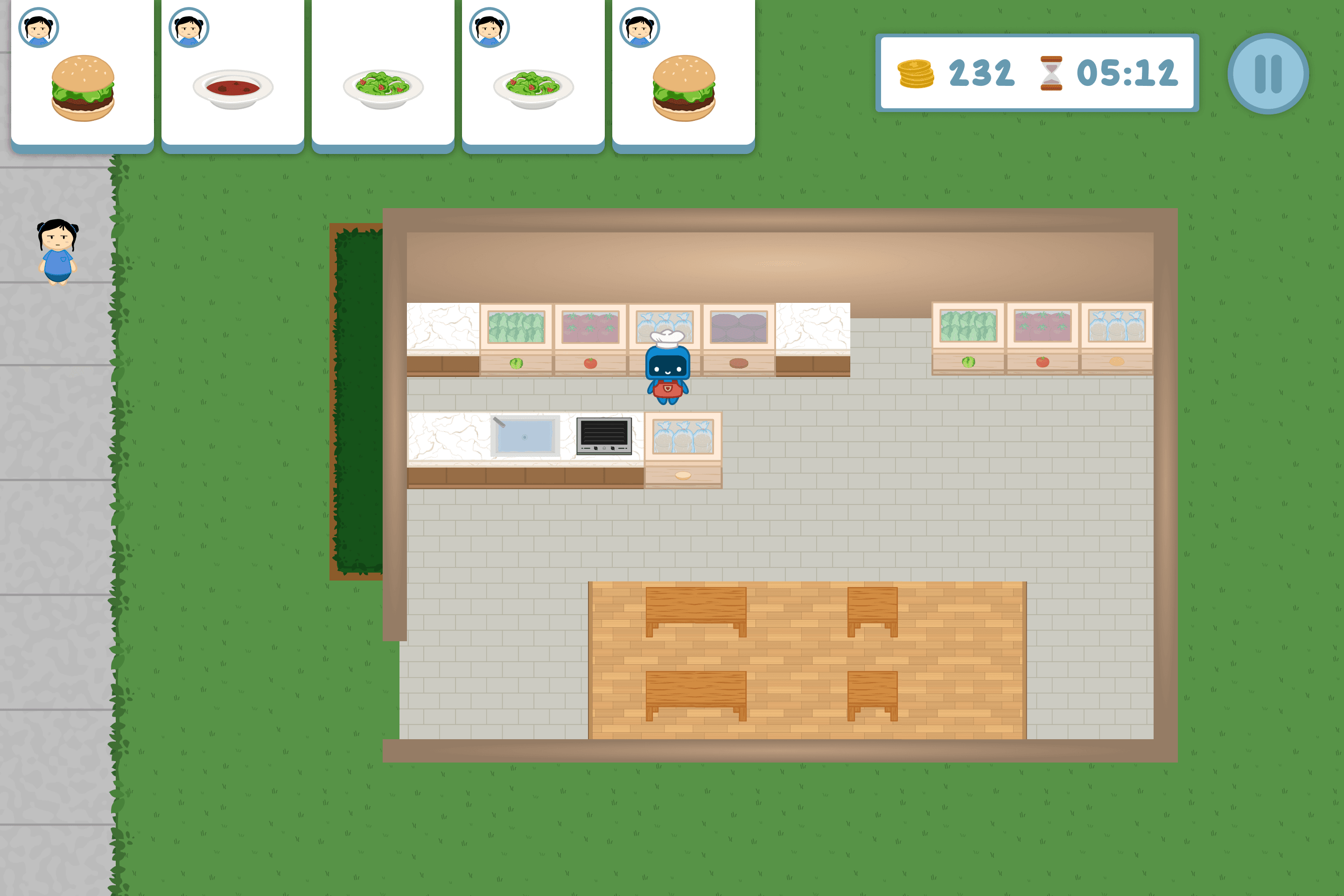
Rough prototype of Robotouille's top-down view