PureBlazor
Productivity Upgrade: Streamlined Slash Command Menu
July 2024
Role
UX/UI Designer
UX Researcher
Team
1 lead designer
1 product manager
1 software engineer
Outcome
Improved task flow, boosting satisfaction by 20% post-launch.
OVERVIEW
What is PureBlazor?
PureBlazor is an AI-native .NET CMS that lets developers build anything using only C#.
The Challenge
Developers building with PureBlazor needed a lightweight, keyboard-first solution to speed up component input without breaking focus or flow.
The Power of Slash Command Menus for Productivity
Slash command menus (SCMs) are proven to boost productivity by enabling users to execute commands and navigate tasks without breaking focus. Popularized by tools like Slack and Notion, SCMs reduce context switching and streamline workflows.
In developing the slash command menu for PureBlazor, I aimed to bring similar productivity benefits to developers.
RESEARCH
I conducted a visual audit of slash command menus in Slack, Notion, and Discord to explore established patterns. While these provided useful inspiration, I approached them critically - recognizing that their solutions don’t always apply directly.
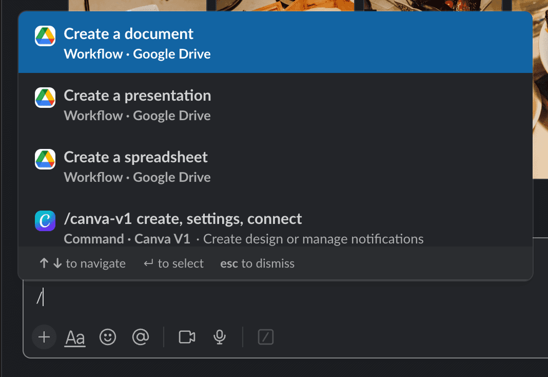
Slack's CSM
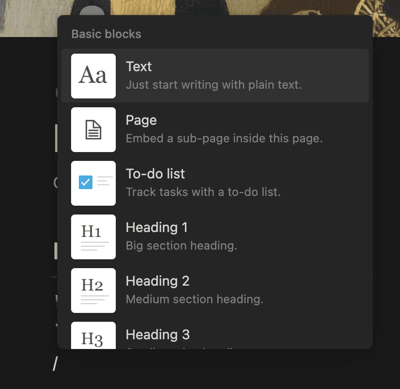
Notion's CSM
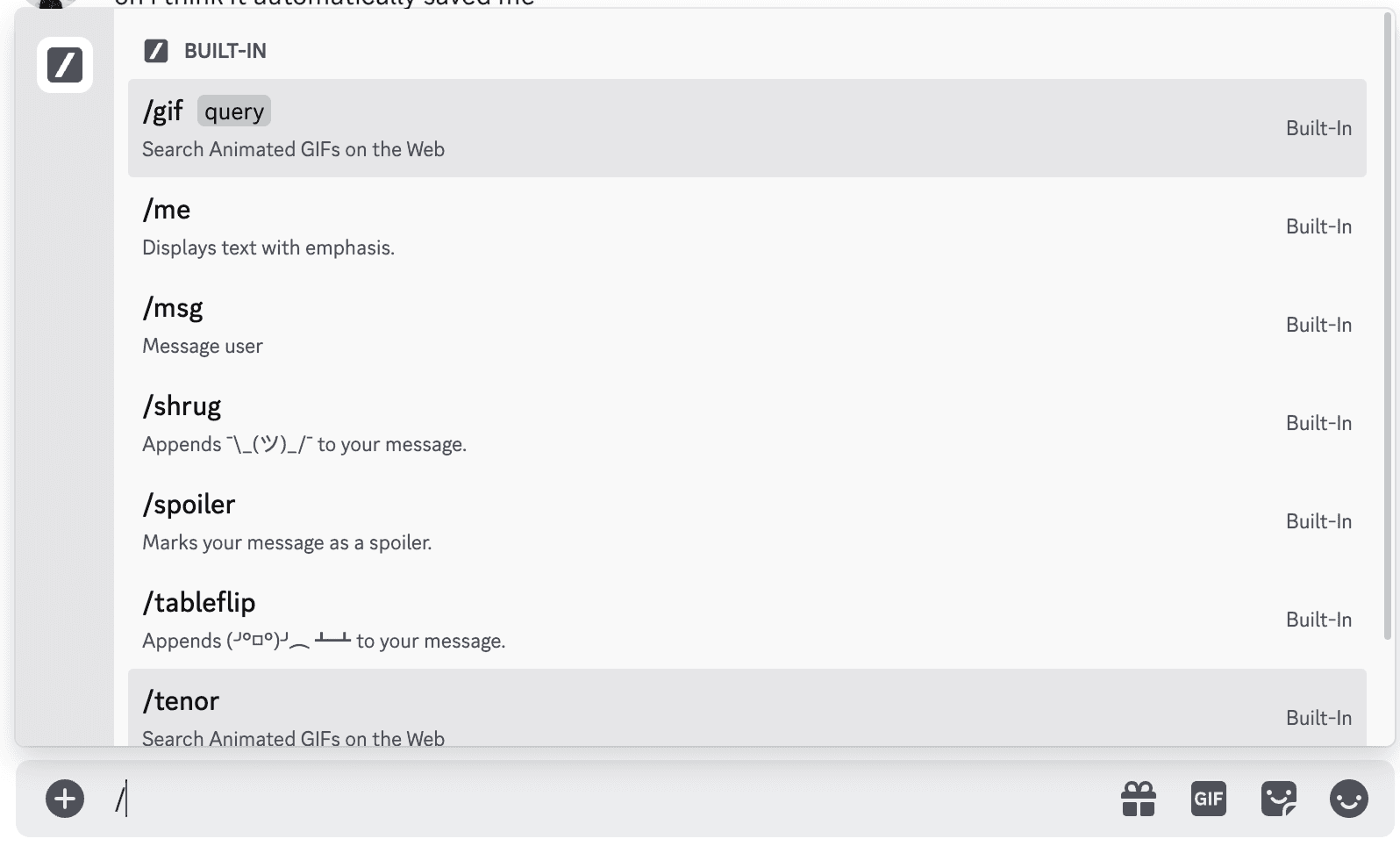
Discord's CSM
✅ Outcome: I selectively borrowed familiar patterns (like grouped categories and icon cues) while simplifying the layout to match the fast-paced, focused mindset of developers.
HOW MIGHT WE…?
After auditing existing slash command menus, I shifted focus to our users (developers)
I framed several How Might We (HMW) questions that turned key user needs into design opportunities:
HWE make command execution feel fast and frictionless for keyboard-first users?
HWE help developers discover and recall commands without interrupting their flow?
✅ Outcome: I prioritized features like keyboard-first navigation, recently-used commands, and minimal UI distractions - all rooted in the way developers actually work.
ITERATION #1
Initial Exploration
With the competitive audit insights in hand, I transitioned to creating the initial wireframe to imagine the workflow and developed the first iteration of the prototype.
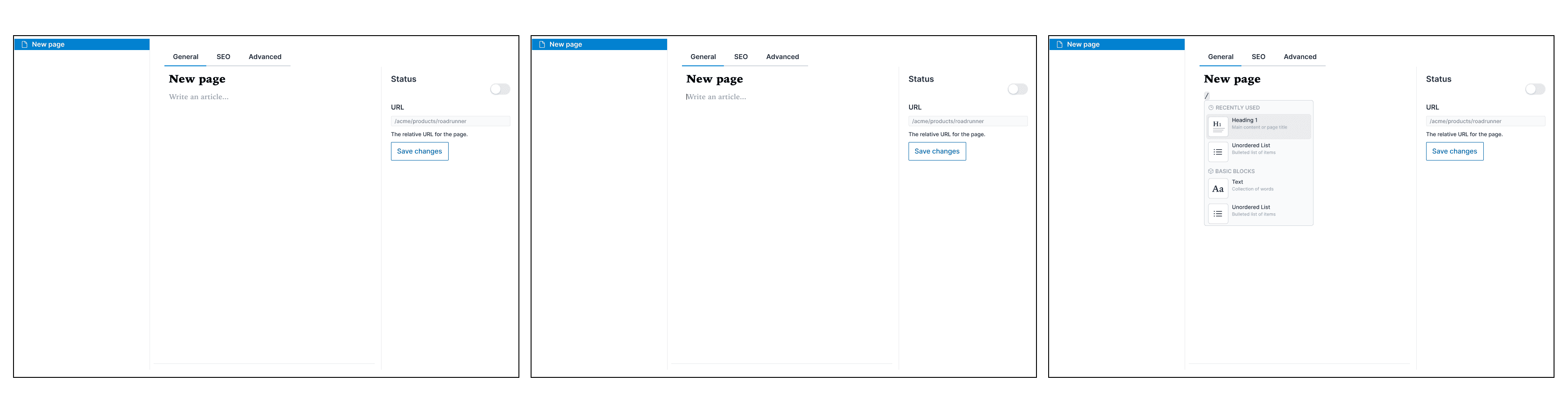
CSM Flow Iteration #1
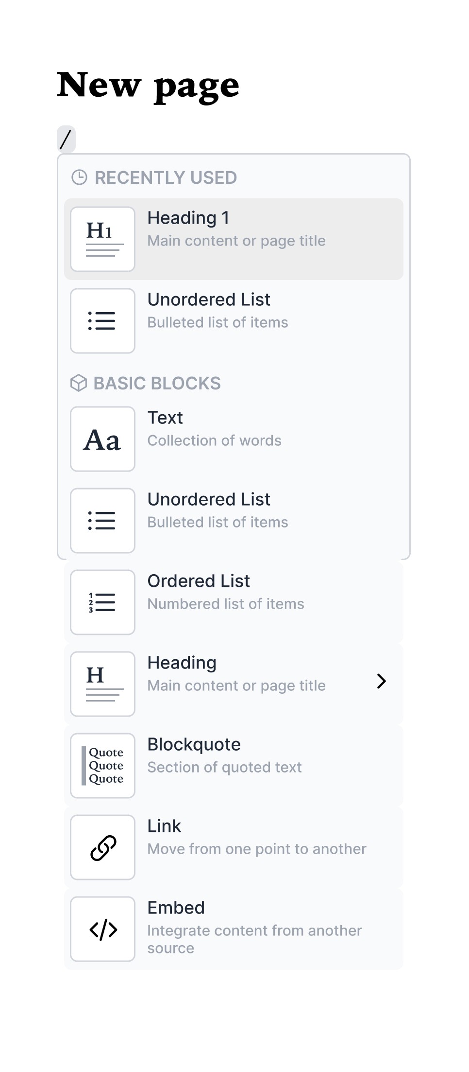
CSM Iteration #1
The prototype was presented to the team, focusing on ease of use, functionality, and the clarity of the command categories. Some concerns with the design:
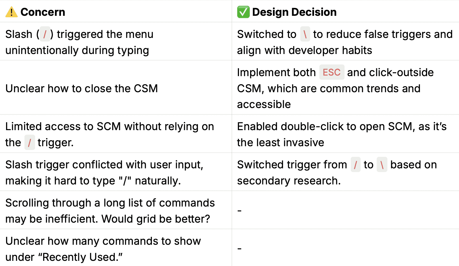
Refining the Trigger Mechanism
After my first iteration, my team pointed out that using the forward slash ("/") as a trigger caused friction when typing dates or file paths. To validate this, I looked into developer forums like Reddit, where users echoed the same issue.
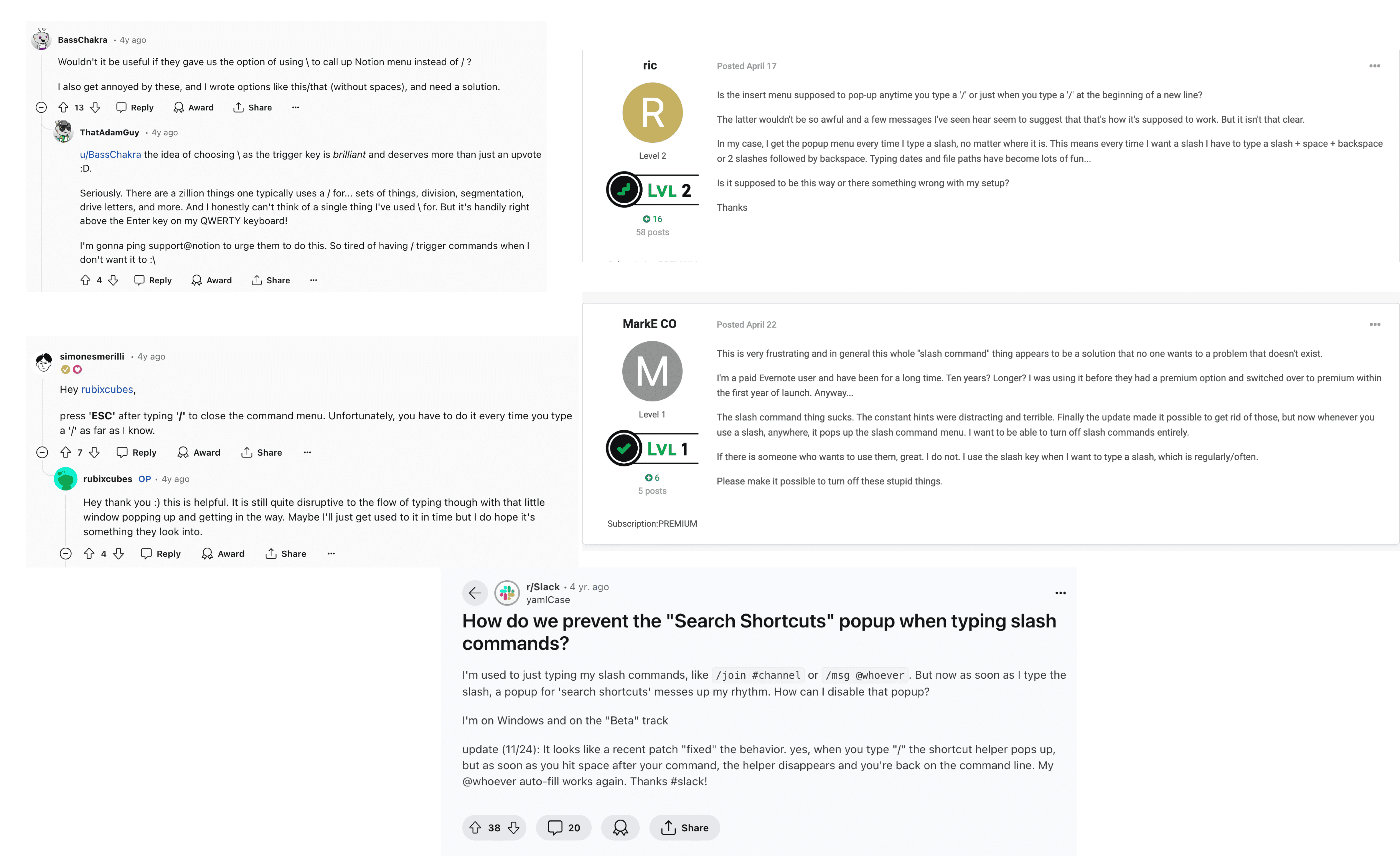
Users struggle with the SCM popping up unnecessarily when using "/"
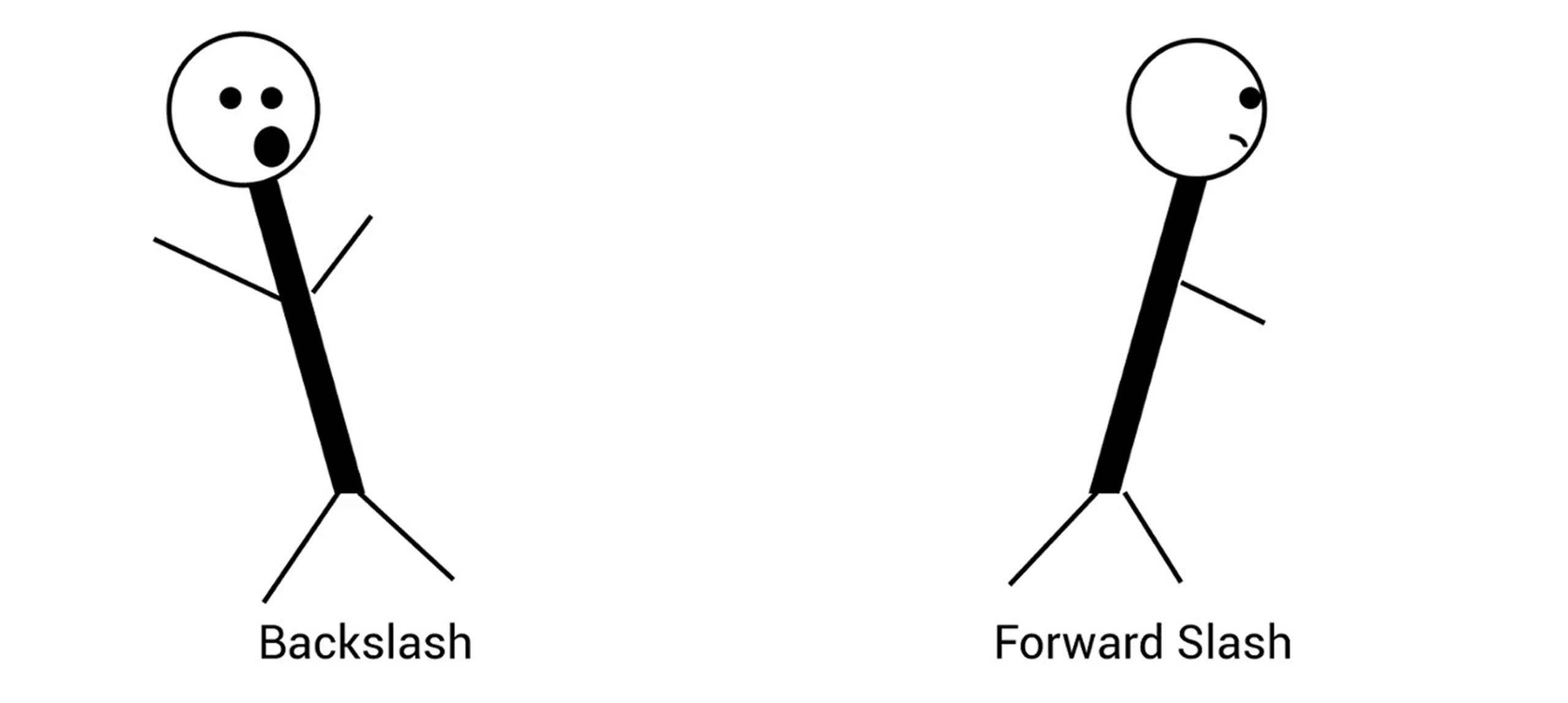
Photo credit: Jason Aillaud, YouTube
✅ Outcome: Based on user suggestions, I replaced the forward slash ("/") with a backward slash ("\") to reduce accidental triggers and better support developer workflows.
ITERATION #2 + USER RESEARCH
List or Grid View? 🔍
Based on the discussion with my team, I created prototype iteration #2 to explore how grid view might look:
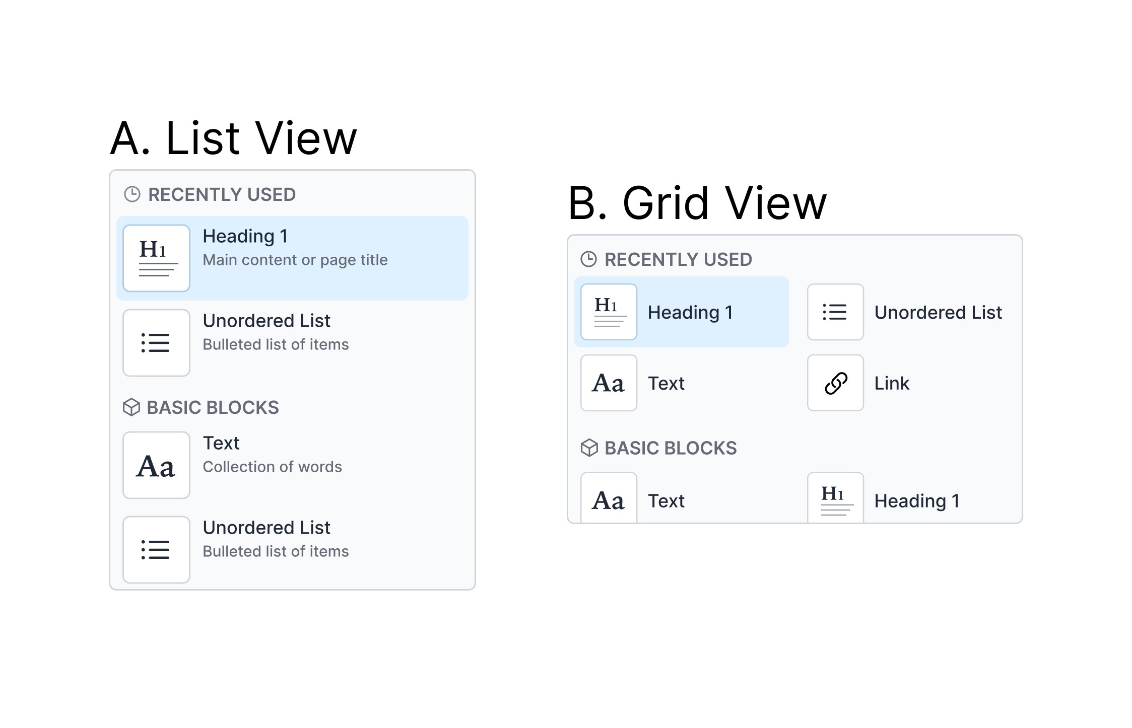
CSM Iteration #2: List and Grid
To gather insights about the remaining unanswered questions we had, I conducted a survey with 85 responses and 51 qualified users.
Summarized Results
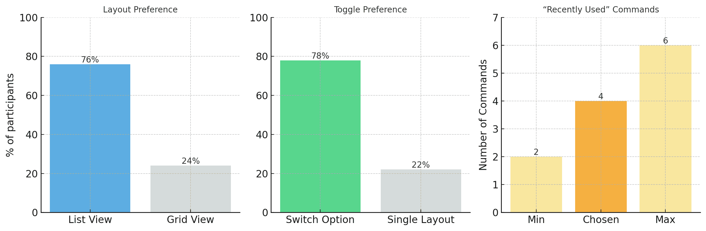
76% of participants preferred the list view over the grid view, citing familiarity and better reading flow.
78% supported having both layout options, favoring a toggle that allows users to switch between list and grid.
The recommended number of “recently used” commands falls between 2 and 6 - we chose 4 as a balanced middle ground to avoid clutter while preserving utility.
✅ Outcome: The research led us to set list view as the default, add a layout toggle for flexibility, and cap recently used commands at 4 to reduce clutter.
Iteration #3
Narrowing Down The Possibilities 🎯
Based on the survey results, I created various options of what the CSM might look like and conducted a follow-up survey with users:
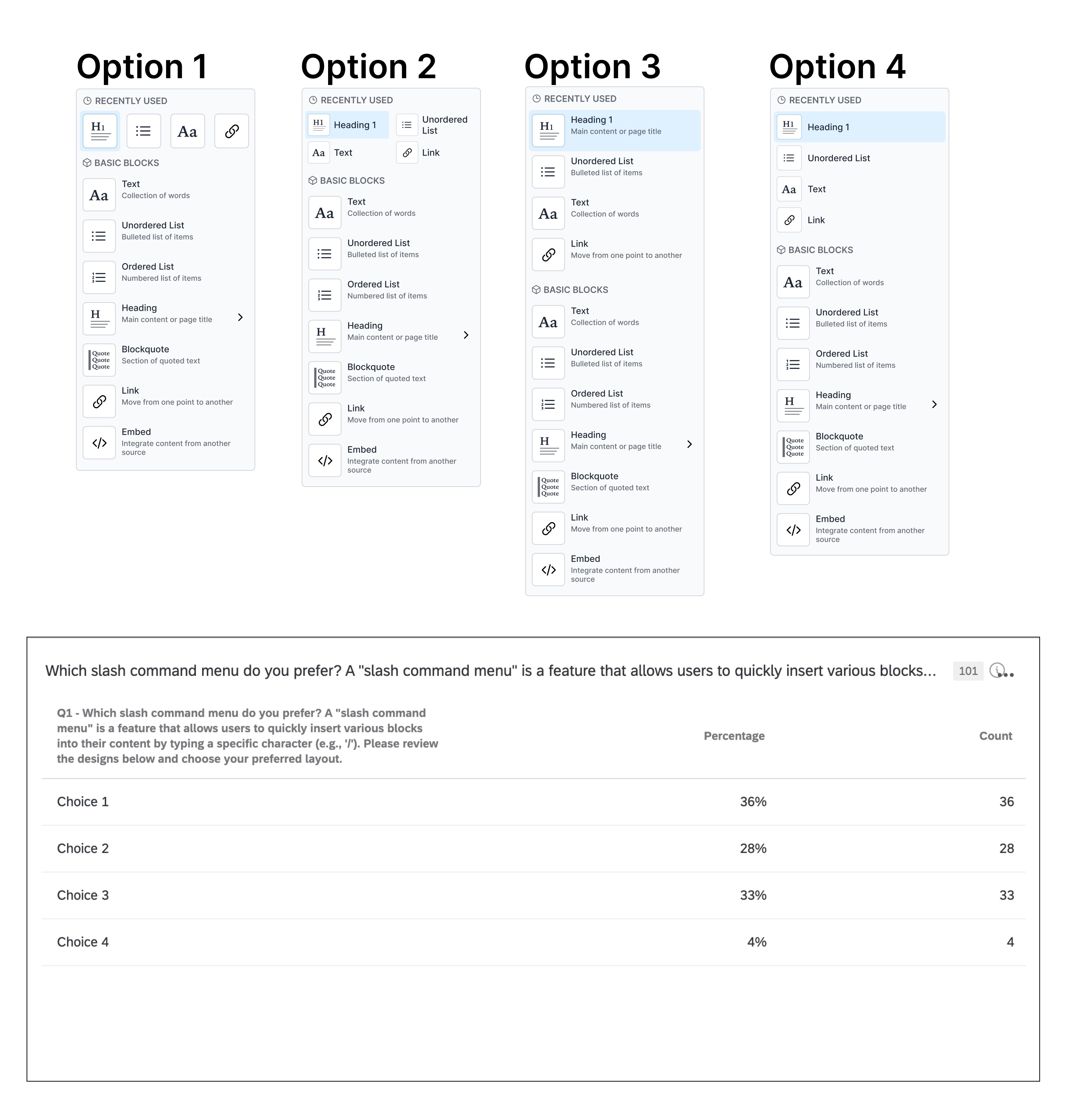
Survey results for CSM options
✅ Outcome: Based on survey results and team alignment, we chose Choice 1 for its simplicity and clarity, as it received the most votes and resonated with users and stakeholders alike.
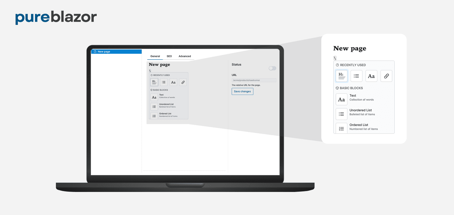
and now introducing the final prototype… :)
Because devs deserve better than cluttered menus 🛠
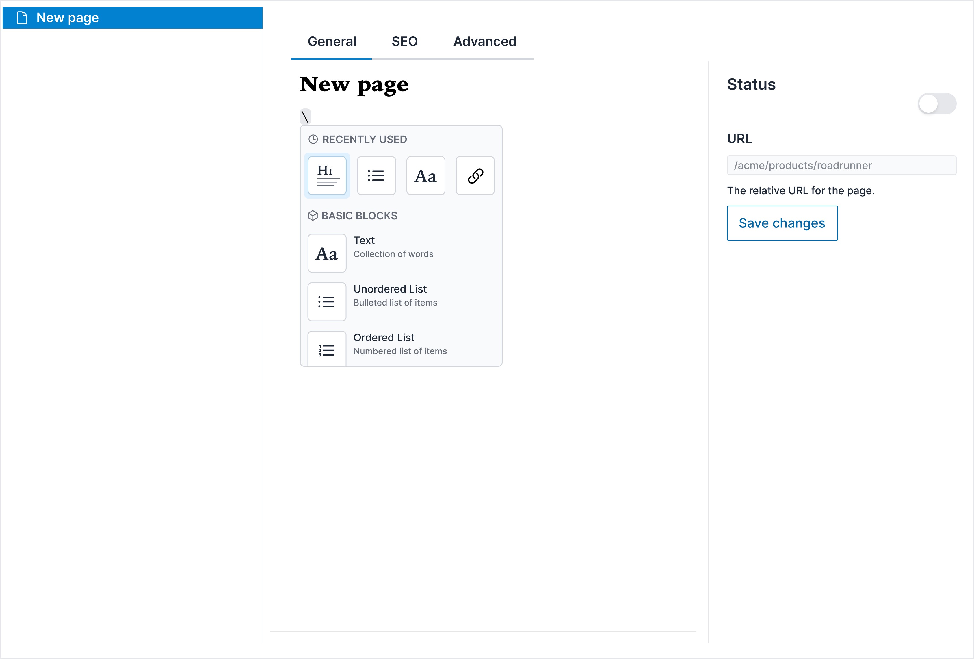
Test out the prototype 👇
IMPACT
While I didn’t have immediate metrics, the outcome spoke for itself:
✅ Outcome: The cofounders were so impressed with the prototype that they offered me equity in the company and invited me to join the team.
This validated not only the design direction but also my ability to drive product clarity and decision-making through UX.